Inequality is a hot topic in the media right now, and I’ve seen it come up again and again in social science courses, particularly those with a strong sociology or economics presence. You’ll notice a handful of inequality visualisations in the database – see Wealth Inequality (charts), Wealth Inequality in America (animated explainer video) and the World Inequality Database on Education (interactive).
I try to avoid placing too many US-centric visualisations in the database, as this site is primarily for the use of UK teachers, but I think we can learn something from a lot of the visualisations that are out there, covering American, global and city-specific inequality indicators.
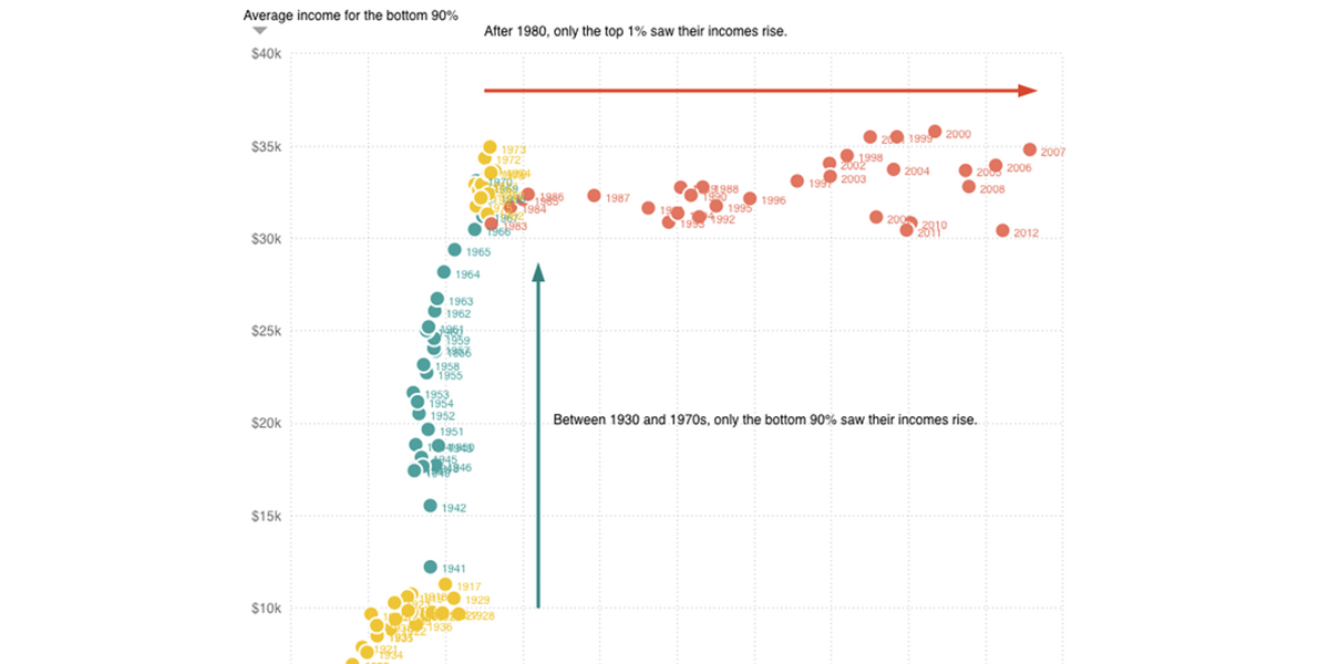
The History of American Inequality
Source: The Washington Post
This one focuses specifically on America, and shows the changes in income inequality over time.
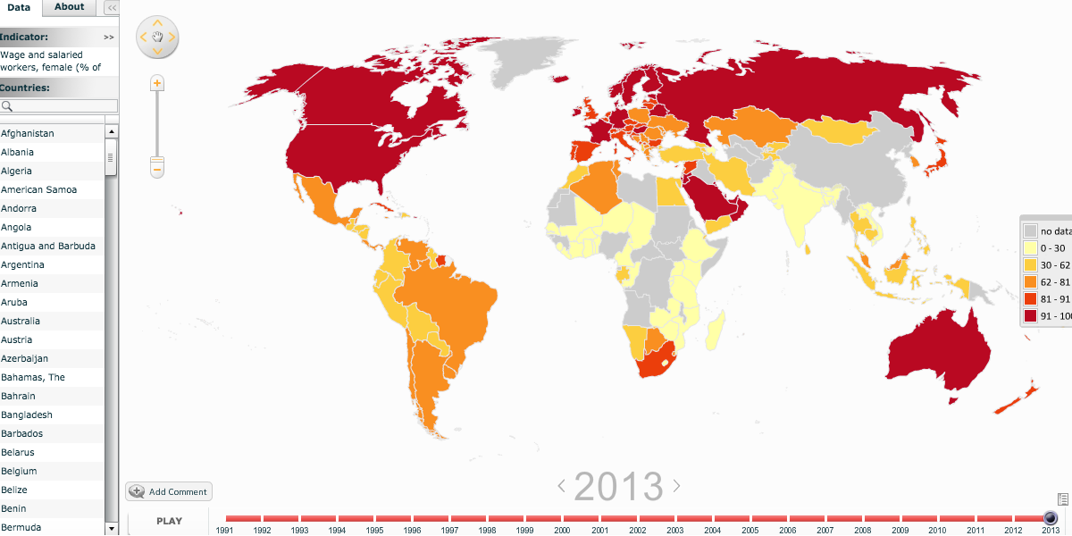
Gender Equality Indicators
Source: The World Bank
This one is a global view of gender inequality.
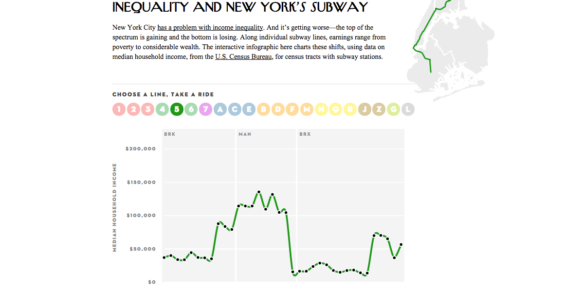
Inequality and New York’s Subway
Source: The New Yorker
This one has an interesting angle – it looks at lines on the New York subway, and traces income inequality across the distance of travel.
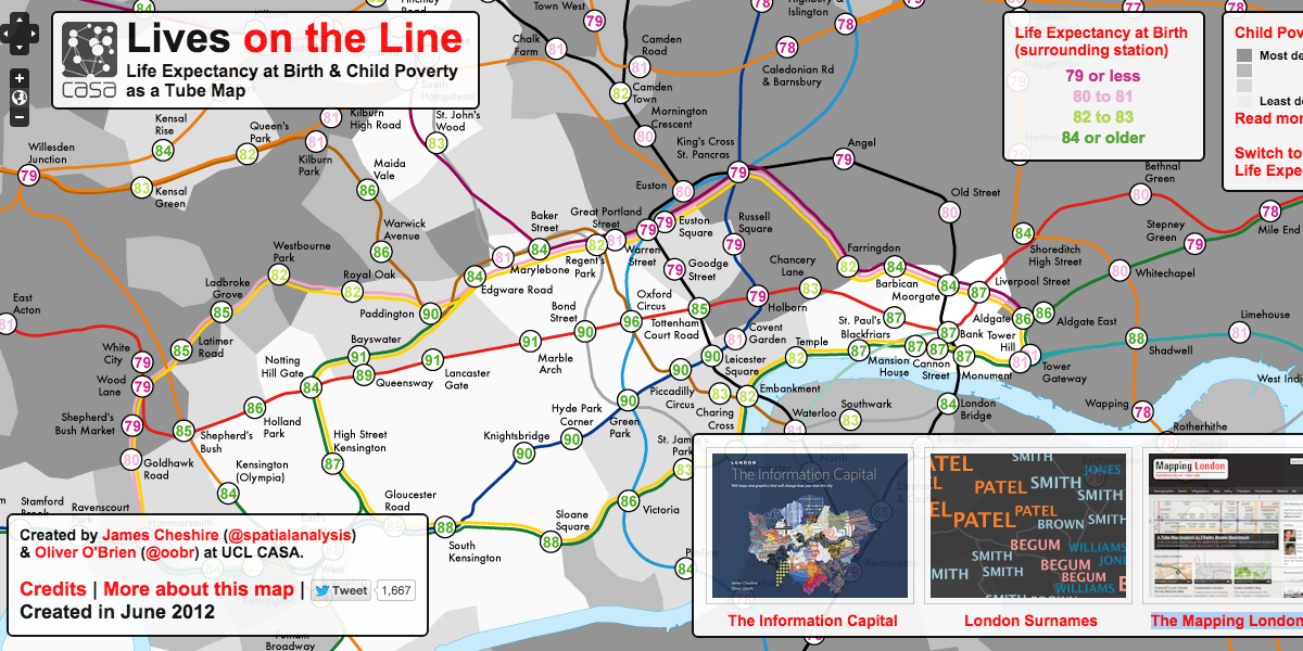
Lives on the Line
Source: Mapping London
This one is similar to the above, in that it focuses on the lengths of subway lines – here, in London, but this time, we’re looking at child poverty and life expectancy.
Have you seen any inequality data visualisations that I should add to this list? Let me know in the comments!


No comments yet.