Archive | Social Sciences

lives-on-the-line

The Visual Display of (In)equality

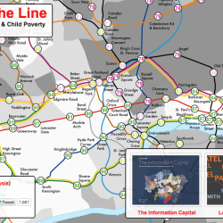
Inequality is a hot topic in the media right now, and I’ve seen it come up again and again in social science courses, particularly those with a strong sociology or economics presence. You’ll notice a handful of inequality visualisations in the database – see Wealth Inequality (charts), Wealth Inequality in America (animated explainer video) and the […]
Continue Reading 0
where-are-the-jobs

Pointillist Mapping

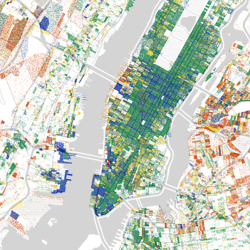
Borrowing from the style of pointillist artists like Georges Seurat and Vincent Van Gogh, the following three maps show data overlaid on maps using a tiny dot for each data point. While it is difficult to extract quantifiable data from this type of display, it is useful as a big picture overview. Here are three pointillist […]

Continue Reading 0
opinion-polls-your-seat

Visualising the 2015 UK Election

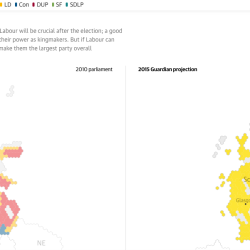
The recent UK election introduced many opportunities for visualisation and interaction. Prior to the election, these assets helped voters to decide which party to vote for, showed opinion polls, and compared current trends with historical election results. Post election, results were visualised in maps and charts. What Did the Opinion Polls Say About Your Seat? Creator: […]

Continue Reading 0