Archive | Map

building-inspector

Crowdsourced Mapping

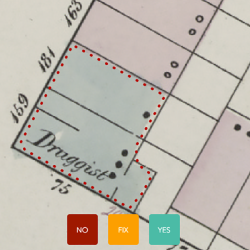
If you’re a map geek like me, the New York Public Library has a project for you. They are looking for citizen cartographers to help digitise historic city maps. They are running a computerized system that gathers detail from old maps, and they need help from humans to check and add information to them. You […]
Continue Reading 0
lives-on-the-line

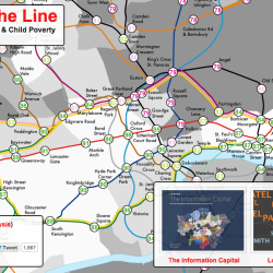
The Visual Display of (In)equality

Inequality is a hot topic in the media right now, and I’ve seen it come up again and again in social science courses, particularly those with a strong sociology or economics presence. You’ll notice a handful of inequality visualisations in the database – see Wealth Inequality (charts), Wealth Inequality in America (animated explainer video) and the […]

Continue Reading 0
salary-to-buy

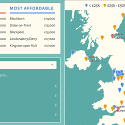
The Salary Needed to Buy a Home in the UK

This handy interactive viz from Go Compare shows the salary you’d need to buy a flat or house in the UK. It is useful for young people looking to get on the housing ladder, but also perhaps for students of introductory Economics who are thinking about the relationship between salary and assets, and covering concepts […]

Continue Reading 0
where-are-the-jobs

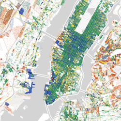
Pointillist Mapping

Borrowing from the style of pointillist artists like Georges Seurat and Vincent Van Gogh, the following three maps show data overlaid on maps using a tiny dot for each data point. While it is difficult to extract quantifiable data from this type of display, it is useful as a big picture overview. Here are three pointillist […]

Continue Reading 0
deadliest-ebola-outbreak

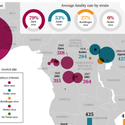
The Ebola Epidemic

The ongoing Ebola epidemic in West Africa that began in 2014 has spurred the development of many visualisations, most commonly by news outlets, but also by health organizations, in an effort to explain the situation. Many have used maps to show the location of active outbreaks. In this post, I’ll showcase a few of the many […]

Continue Reading