Author Archive | Laura

virus-trading-cards

Virus Trading Cards

Eleanor Lutz over at Tabletop Whale makes these wonderful scientific animated GIFs. Her latest production is a set of virus trading cards. Who knew that germs could be so beautiful?   Take a look at her Virus Trading Cards post and while you’re there, have a look at some of her other projects. You won’t be […]

Continue Reading 0
brexit-lose

Let’s Talk About ‘Brexit’

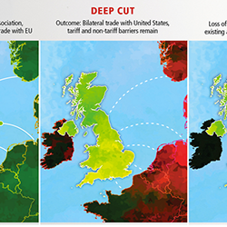
There is a lot of buzz in the media about whether or not Britain should vote to stay in the EU, or if we will vote to exit the union on the referendum date of June 23rd, this year. Coupled some recent negative press around PM David Cameron’s tax affairs, and vocal support for the […]

Continue Reading 0
beethoven

For the Love of the Google Doodle

I love the Google Doodle, don’t you? It’s always a surprise, and a great way to learn about some famous and not-so-famous people and events. I also appreciate it when Google makes a political point, like they did with their Sochi Olympics doodle and its accompanying quote from the Olympic charter. It marks dates we […]

Continue Reading 0
atlantic-slave-trade

The History of Slavery in Maps and Diagrams

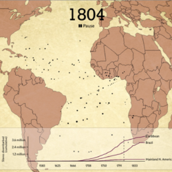
Britain’s role in the transatlantic slave trade appears in the History curriculum at key stage 3. You may want to extend the learning here to cover slavery on an international scale, perhaps having learners research and report on incidences of slavery in other countries, at other times in history, or even in the modern day. There may […]

Continue Reading 0
your-life-on-earth

Your Life on Earth

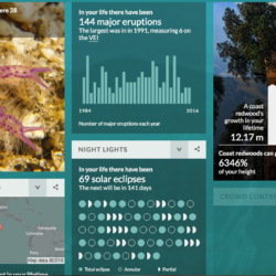
The BBC produced a fun interactive that can help learners see how the world has changed in their lifetime. By entering some personal details like date of birth and height, you’ll see details about your life, like: how your heartbeat frequency compares to a blue whale’s how many solar eclipses there have been CO2 emissions Extinct […]

Continue Reading 0
building-inspector

Crowdsourced Mapping

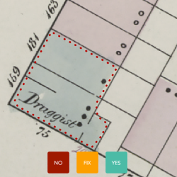
If you’re a map geek like me, the New York Public Library has a project for you. They are looking for citizen cartographers to help digitise historic city maps. They are running a computerized system that gathers detail from old maps, and they need help from humans to check and add information to them. You […]

Continue Reading 0

Data as Art

One of the more experimental applications of data visualisation is when it blurs the line between science and art. Here are a few of my favourite data art projects. City Lights at Night Source: Doug McCune What can you learn about a city by mapping various metrics so that they look like lights from above? […]

Continue Reading 0
london-underground-live

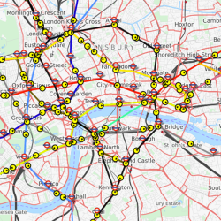
Visualising Transportation Data

As I write this on a Thursday afternoon, there are over 10,000 commercial aircraft in the air, worldwide (according to FlightRadar24). The site itself is an engaging real-time visualisation, ideal for showing the live flights in the sky above you as you introduce the science of flight to students. There are an expected 31.7 million […]

Continue Reading 0
moocs-v2

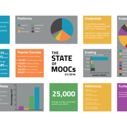
The State of MOOCs

What’s happening with Massive Online Open Courses (MOOCs) in 2016? I recently blogged about this over on our company blog. The post contains a presentation and infographic containing statistics and best practices for developing a MOOC this year. If you plan to enrol in MOOCs, use their content in your courses, or if you’re part of a […]

Continue Reading 0
lives-on-the-line

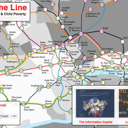
The Visual Display of (In)equality

Inequality is a hot topic in the media right now, and I’ve seen it come up again and again in social science courses, particularly those with a strong sociology or economics presence. You’ll notice a handful of inequality visualisations in the database – see Wealth Inequality (charts), Wealth Inequality in America (animated explainer video) and the […]

Continue Reading 0