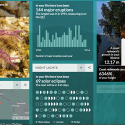
The BBC produced a fun interactive that can help learners see how the world has changed in their lifetime. By entering some personal details like date of birth and height, you’ll see details about your life, like: how your heartbeat frequency compares to a blue whale’s how many solar eclipses there have been CO2 emissions Extinct […]
Archive | Geography
The Visual Display of (In)equality
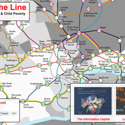
Inequality is a hot topic in the media right now, and I’ve seen it come up again and again in social science courses, particularly those with a strong sociology or economics presence. You’ll notice a handful of inequality visualisations in the database – see Wealth Inequality (charts), Wealth Inequality in America (animated explainer video) and the […]