Author Archive | Laura

deadliest-ebola-outbreak

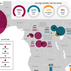
The Ebola Epidemic

The ongoing Ebola epidemic in West Africa that began in 2014 has spurred the development of many visualisations, most commonly by news outlets, but also by health organizations, in an effort to explain the situation. Many have used maps to show the location of active outbreaks. In this post, I’ll showcase a few of the many […]
Continue Reading
opinion-polls-your-seat

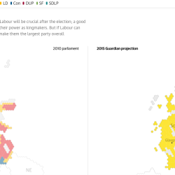
Visualising the 2015 UK Election

The recent UK election introduced many opportunities for visualisation and interaction. Prior to the election, these assets helped voters to decide which party to vote for, showed opinion polls, and compared current trends with historical election results. Post election, results were visualised in maps and charts. What Did the Opinion Polls Say About Your Seat? Creator: […]

Continue Reading 0
indyref-social

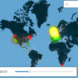
The Scottish Independence Referendum

Timely topics provide ideal fodder for data visualisation. Last year, the Scottish Independence Referendum spurred on an outpouring of infovis content. The outcome of this referendum was largely influenced by the inclusion of 16 and 17-year-old-voters, who were eligible to vote in this referendum, the first time the voting age has been lowered in the UK. […]

Continue Reading 0