Cave Paintings at Lascaux (15,000 BCE)

Discovered in a cave in Lascaux, France in 1940, these were painted by the paleolithic inhabitants of the area some 17,300 years ago. The paintings show animals, humans and abstract symbols. Theories suggest that these paintings could depict the results of a hunt or prehistoric star charts.
Anaximander’s Map of the Known World (610 BC-546 BC)
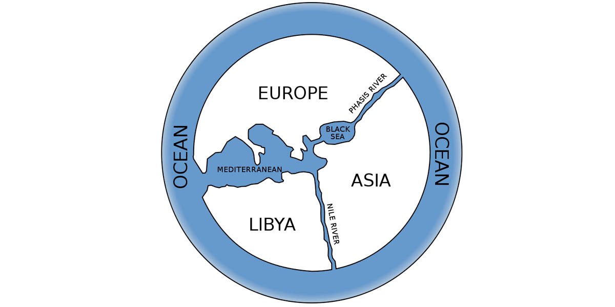
Greek philosopher Anaximander is thought to have created the first world map, which shows the inhabited land known to the ancient Greeks.
Joseph Priestley’s A Specimen of a Chart of a Biography (1765)
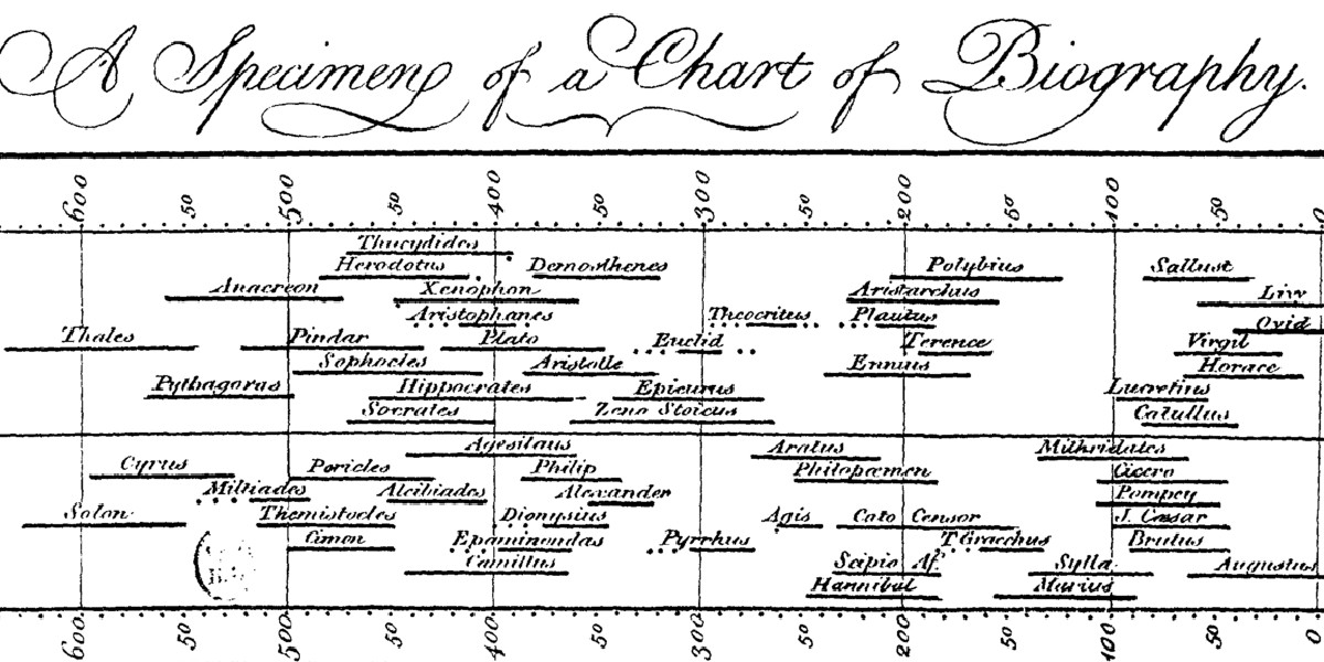
Covering a span from 1200 BC to 1800 AD, this early timeline charts the lifespan of 2000 “famous” people. It includes six categories: Statesman and Warriors, Divines and Metaphysicians, Mathematicians and Physicians (also includes philosophers), Poets and Artists; Orators and Critics (also includes fiction authors), and Historians and Antiquarians (including lawyers).
William Playfair’s Wheat and Wages (1821)
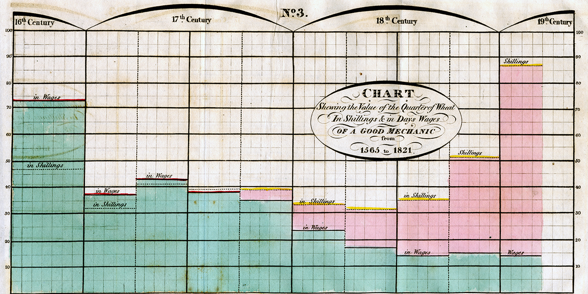
This is a time-series graph comparing the price of wheat and the weekly wage of a good mechanic, between 1565 and 1821.
John Snow’s Cholera Map (1854)
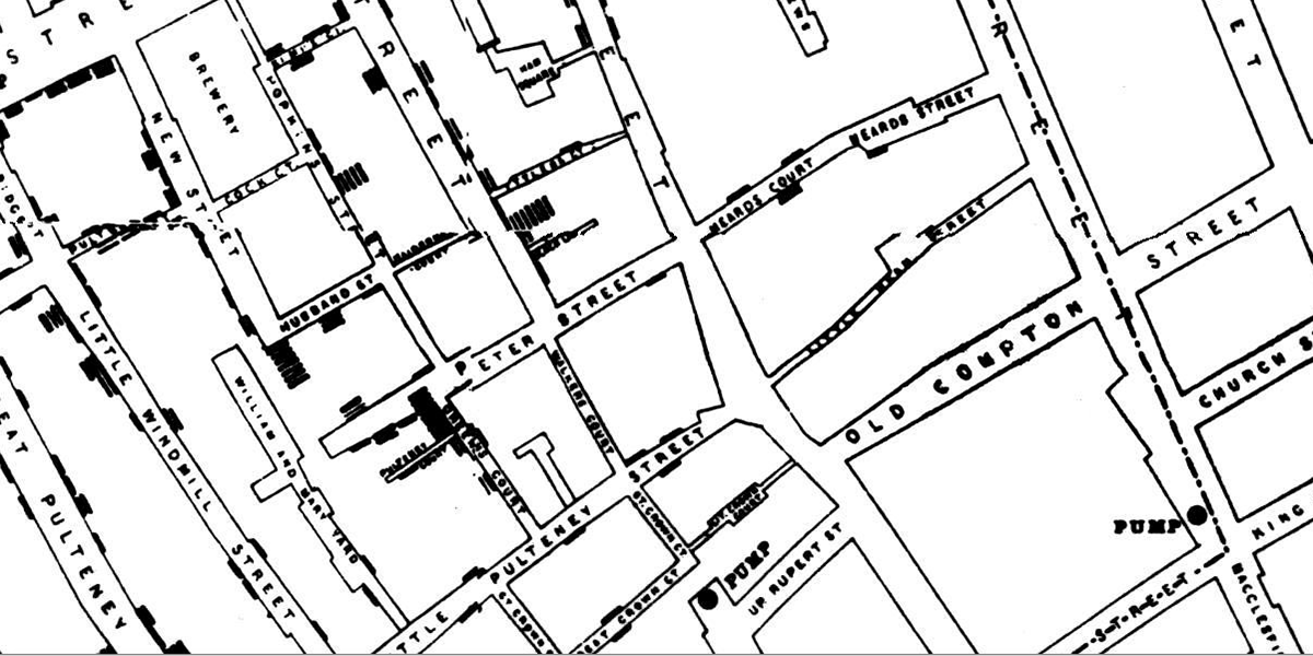
In Victorian times, it was thought that diseases like cholera and the plague were spread by pollution or “bad air”. Physician John Snow was sceptical of this idea, so when a cholera outbreak occurred in London’s Soho, he created a dot map to show that cholera cases were clustered around a water pump, establishing that the disease is water-borne.
Florence Nightingale’s Mortality Graphs (1858)
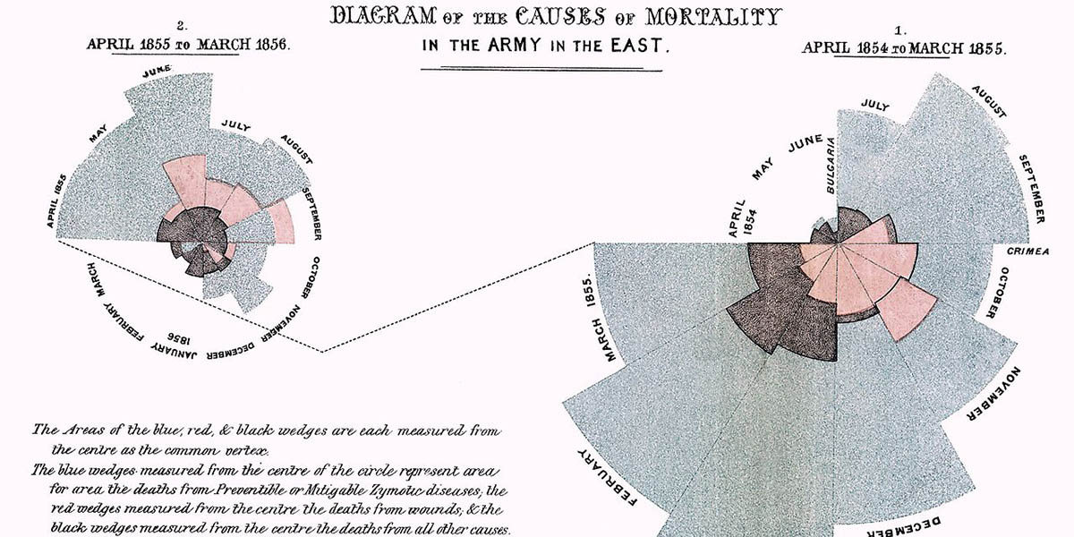
Crimean War nurse Florence Nightingale was a pioneer of data visualisation. When British soldiers were wounded in the war, they were sent across the Black Sea to hospitals in Turkey, where conditions were poor. Many more soldiers died from disease than from their wounds. When Nightingale arrived as a volunteer, she began keeping records of the death toll and drew these coxcomb graphs to explain her findings.
Charles Joseph Minard’s Map of Napoleon’s Russian Campaign (1869)
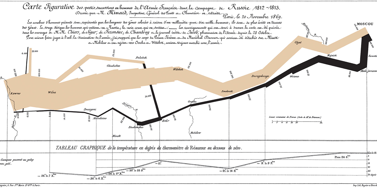
This Sankey diagram shows losses suffered by Napoleon’s army during the Russian campaign of 1812. The thick, beige band illustrates the size of his army at locations during their advance and retreat. It displays six types of data: the number of Napoleon’s troops, distance traveled, temperature, latitude and longitude, direction of travel and location.
Charles Booth’s Poverty Maps of London (1903)
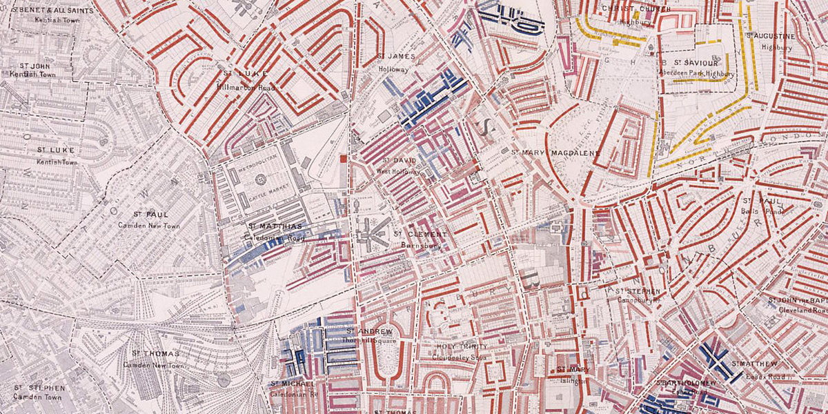
Charles Booth created these maps to examine whether or not social reformers had exaggerated London’s poverty levels. Studies at the time indicated that 1/4 of London’s population lived in poor conditions, but after observing population, working conditions, education, wage levels, religion, and policing, among other data, Booth’s findings showed that the situation was even worse, at 1/3 of the population. The map uses colour coding to show varying levels of poverty in areas across the city.
Otto Neurath’s Isotypes (1920s)
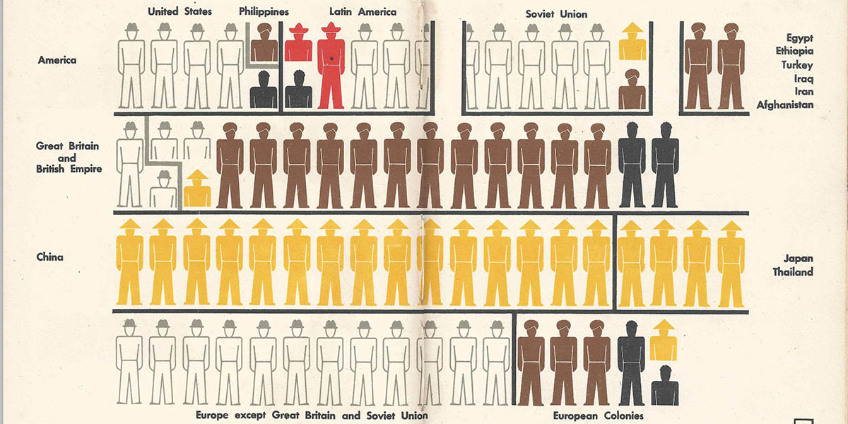
Designed as a learning aide, Isotypes are pictograms developed as a visual language. They intended to represent social facts using images, and to bring statistics to life by making them visually appealing and memorable. Isotypes are heavily used in the design of infographics we see today.
Harry Beck’s London Underground Map (1931)
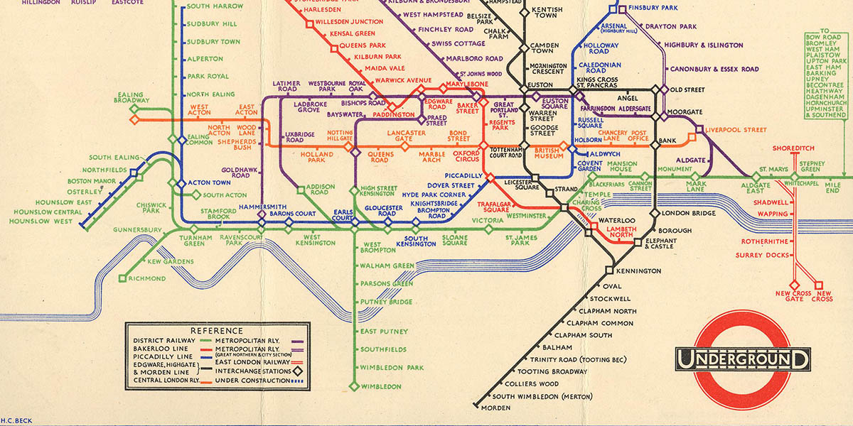
Maps make up a significant proportion of the data visualisations that we see today. This one is a simplification of the London Underground network. Beck realized that the arrangement of stations as they appear above ground was not as relevant to people using the transport system than the relationships between the stations is. By concentrating on this element, Booth was able to produce a map of the network that allows the viewer to quickly plan a journey. This relative ignorance of the above ground topography does favour locals over visitors to London, however. A newcomer might make the two changes needed on the tube to get from Chancery Lane to Farringdon stations, while a local is more likely to walk, knowing that these stations are actually less than a half mile apart.
Comments are closed.