I’ve often thought of data visualisation as a very digital thing. In this journey I’m on, to learn how to present and analyse data visually, I’ve felt a bit let down by my lack of programming skill. I’ve always kept sketchbooks and made lists and doodled, but code is not, and I fear may never be, a medium where I am entirely comfortable.
I’ve also always been a bit obsessed with other people’s journals, drawings, notes and other ephemera. So, to see this project from two designers who don’t code, are best known for their handmade work, was hugely inspiring, for me.
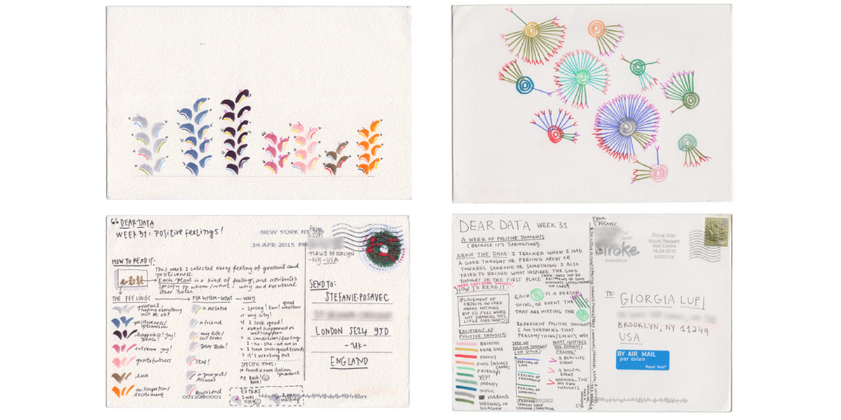
Dear Data is a collaboration between information designers Giorgia Lupi and Stefanie Posavec,
It’s interesting to observe the differences between the two, in terms of style. Stefanie’s multicoloured postcards are a contrast to Giorgia’s more minimalist colour palette. The line work on Giorgia’s postcards draws upon her Architectural training, where Stefanie’s work feels more abstract. There is a difference, too, in the level of interaction with the data. Stefanie seems more objective about the data she is curating – the careful counting and organizing appears to be a key part of her process – while Giorgia’s accounts seem more personal.
The designers – one in New York and one in London – had only met a couple of times in person before undertaking this project. Exploring the minutia of someone’s week seems such a lovely way to get to know someone.
I’ve really enjoyed the behind-the-scenes photos they’ve included on the website with each post. It is reminiscent of the artists & designers sketchbooks that I’ve found myself collecting over the years. I love to have that peek behind the curtain that shows a little bit about how these creative minds work. I can’t wait to see what they come up with next week!
No comments yet.