Archive | July, 2015

where-are-the-jobs

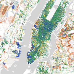
Pointillist Mapping

Borrowing from the style of pointillist artists like Georges Seurat and Vincent Van Gogh, the following three maps show data overlaid on maps using a tiny dot for each data point. While it is difficult to extract quantifiable data from this type of display, it is useful as a big picture overview. Here are three pointillist […]
Continue Reading 0
daily-routines

Great Storytellers, Creative Minds

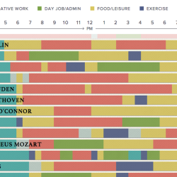
“Creativity is just connecting things. When you ask creative people how they did something, they feel a little guilty because they didn’t really do it, the just saw something. It seemed obvious to them after a while” – Steve Jobs I’m seeing infographics on creativity a lot recently and loving it. I’ve always had a […]

Continue Reading 0
isotype

The History of Data Viz

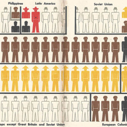
Cave Paintings at Lascaux (15,000 BCE) Discovered in a cave in Lascaux, France in 1940, these were painted by the paleolithic inhabitants of the area some 17,300 years ago. The paintings show animals, humans and abstract symbols. Theories suggest that these paintings could depict the results of a hunt or prehistoric star charts. Anaximander’s Map of […]

Continue Reading
dear-data

Hand-Drawn Visualisations: Dear Data

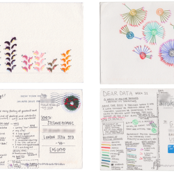
I’ve often thought of data visualisation as a very digital thing. In this journey I’m on, to learn how to present and analyse data visually, I’ve felt a bit let down by my lack of programming skill. I’ve always kept sketchbooks and made lists and doodled, but code is not, and I fear may never be, a […]

Continue Reading 0
who-needs-gps

Gamifying Geographic Knowledge

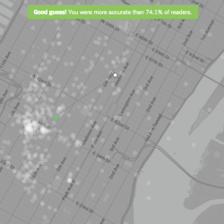
I won’t lie — my geographic knowledge of New York City landmarks isn’t great. Having spent a total of four days in Manhattan so far in my life, I didn’t expect a gold star on The New York Times’ recent interactive — Who Needs a GPS? A New York Geography Quiz. (and yes, I think this […]

Continue Reading 0